← Selected Work
  • Lead Designer
  • ·
  • Fintech
  • ·
  • Narrative · IA

Rebuilding a fintech website through narrative clarity.

A redesign that treated the homepage as the product's first conversation — moving from feature lists to a structured, readable content system built around comprehension.

brand
Product
Solutions
Pricing
Resources
Headline · H1
Equity infrastructure for private companies.
On this page
  • 01What we do
  • 02How it works
  • 03Who it's for
  • 04Pricing
  • 05FAQ
Section · what
Section · how
Section · proof
Role
Lead Product Designer
Scope
IA · Narrative · Type system · Content blocks · Templates
01 · Problem

A website that hid what the company actually was

Hissa sits at the intersection of two ideas most readers don't arrive understanding — private-market ownership and the liquidity infrastructure that moves it. The old website asked every visitor to assemble that understanding on their own, from feature pages that talked about modules instead of meaning.

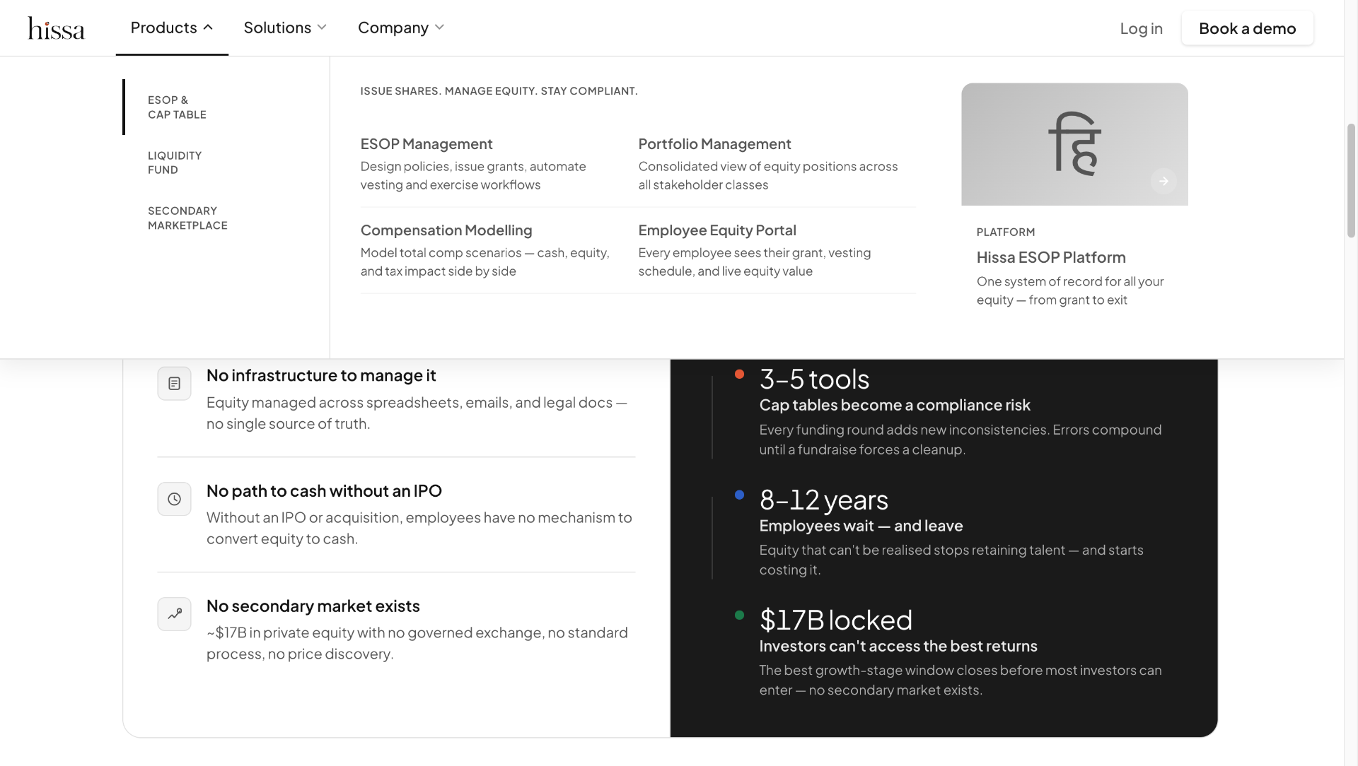
The information architecture had grown one stakeholder request at a time. Sixteen navigation entries, four overlapping product pages, and a homepage that introduced the company three different ways before the fold. There was no order, no priority, no clear answer to what is this and who is it for.

The deeper problem was trust. Private markets are unfamiliar territory for most readers — and a page that can't position itself clearly reads, to a serious buyer, as a company that can't either.

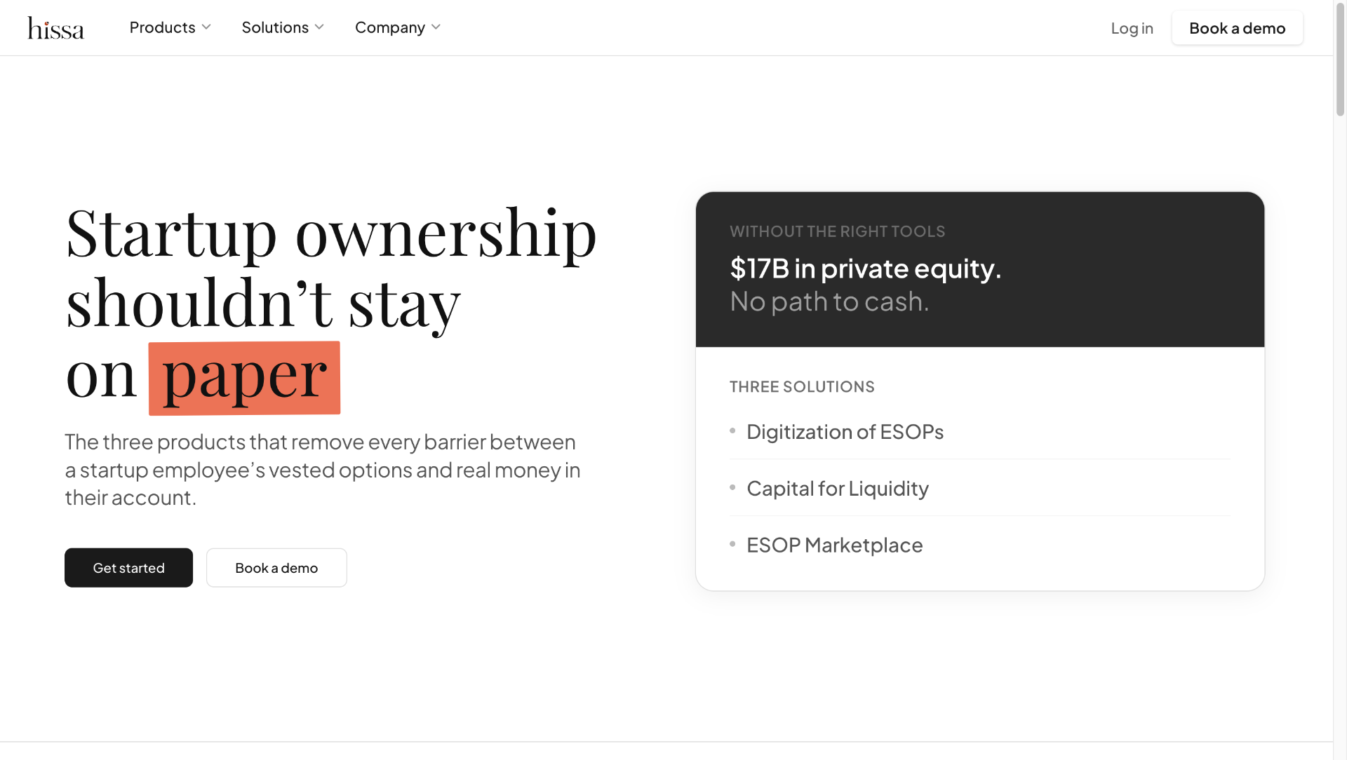
Concepts that needed to land — ownership, liquidity, cap-table infrastructure — were buried under marketing copy that explained features instead of the world the features lived in. A founder evaluating us could not tell, in thirty seconds, whether we were a cap-table tool, a liquidity platform, an ESOP product, or all three.

The brief, written down, was “refresh the design”. The actual problem was structural: the site did not have a point of view about what mattered, in what order, to whom. No amount of new typography would fix that.

I reframed the project as an information architecture, trust, and positioning problem — with visual design as the consequence, not the lead.

Positioning
Three competing introductions before the fold
Architecture
16 nav entries, 4 overlapping product pages
Comprehension
Private-market concepts left for the reader to assemble
Trust
No clear answer to what we are, or who we are for
Hierarchy
Every line carried the same visual weight
Discoverability
Thin pages, no topical structure for search
02 · Frame

A website is a product interface

“We weren't redesigning a marketing site. We were designing the first interface a user ever touches — and treating comprehension as the success metric.”

Once the website is framed as an interface, the questions change. Not “what should the hero animation be”, but “what is the user trying to learn, and in what order does that learning happen”. Not “what colour is the CTA”, but “what would have to be true on this page for someone to earn the right to click it”.

Structure became the design surface. Visual polish came last, and on purpose.

03 · Principles

Borrowed from product, applied to a page

P.01

Recognition over recall

Nielsen's heuristic, applied to navigation. Group entries by user intent, not by internal team. Four labels the reader can recognise will always beat sixteen labels they have to remember.

Before
HomeProductFeaturesSolutionsIndustriesPlatformIntegrationsPricingCustomersResourcesBlogDocsHelpAboutCareersLogin
After
ProductWho it's forResourcesPricingLogin →
Four entries. Each one earns its place.
P.02

Information hierarchy

If everything is bold, nothing is. The page needs a single most-important sentence, and every other element has to defend its weight against it. Hierarchy is a ranking exercise before it is a typography exercise.

Before · undifferentiated
The all-in-one equity, cap table, ESOP, valuation and stakeholder management platform for modern companies.
Manage grants, vesting, exercises, 409A, FMV, secondaries, buybacks, and more — all in one place.
Trusted by 1,200+ companies. SOC 2 certified. Built by ex-bankers.
Every line is the same weight. The reader has to do the ranking.
After · ranked
Equity infrastructure for private companies.

Cap table, ESOP, and valuation in one system of record — built for the people who run it, not the people who buy it.

SOC 2·1,200+ companies
One sentence answers ‘what is this’. The rest earns its place.
P.03

Cognitive load reduction

A reader can hold roughly four ideas in working memory at once. Sections were rebuilt to never present more than that — and to chunk denser material behind progressive disclosure.

Layer 01
What is it
One sentence. Visible above the fold. Answers the question a stranger would ask.
Layer 02
How it works
Three steps. Plain verbs. Read in fifteen seconds.
Layer 03
Why us
Comparison + proof. Only reached by readers who already care.
Layer 04
Specs & docs
Dense reference material. Linked, not embedded.
P.04

Chunking content

Dense paragraphs hide structure. We broke content into named, repeatable blocks — Statement, Definition, Pair, List, Quote, Spec — so the page reads like an outline, not an essay.

Block
Statement
Single sentence. Sets the section's claim.
Block
Definition
Term + plain-language explanation.
Block
Pair
Side-by-side comparison. Same axis, two values.
Block
List · 3
Three items. Used for ‘how it works’.
Block
Quote
Customer language. Attribution + role.
Block
Spec table
Dense, scannable, no marketing copy.
04 · Process

Restructuring before redesigning

Subsection

Why users struggled

We ran twelve unmoderated tasks across three audience segments, asking each person to explain in their own words what the product did after sixty seconds on the homepage. Two people got it right. The rest produced a mix of three different explanations — all of them present on the page, none of them prioritised.

10/12
could not name the primary user
8/12
confused two product surfaces
3/12
found pricing without using search
Subsection

Fragmented information architecture

The old IA was a record of internal politics, not user intent. We rebuilt it from the user's questions — what is it, how does it work, who is it for, what does it cost — and then mapped existing content onto that frame. About forty percent of the old pages did not survive the mapping.

Before · 16 flat entries
HomeProductFeaturesSolutionsIndustriesUse casesPlatformIntegrationsPricingCustomersResourcesBlogDocsHelpAboutCareers
No groupings. Every item competes for attention.
After · 4 grouped intents
Product
  • What it is
  • How it works
  • Pricing
Who it's for
  • Founders
  • Finance teams
  • Employees
Resources
  • Guides
  • Docs
  • Changelog
Company
  • About
  • Careers
Recognition over recall. 4 doors instead of 16.
Subsection

The homepage as first conversation

Treating the homepage as a conversation forced an order. First, what the product is — in one sentence, no jargon. Then how it works, in three steps. Then who it's for. Then proof. Then price. The structure mirrors how the founders explained the product on a call, because that explanation already worked.

brand
Product
Who it's for
Resources
Pricing
01 · Statement
The first conversation. One sentence.
02 · How it works
Three steps. Plain verbs.
03 · Who it's for
Founders · Finance · Employees
04 · Proof
Customer language, not logos as decoration.
05 · Pricing
Dense table. No theater.
06 · FAQ
Objections, answered in writing.
Subsection

Progressive disclosure

Most readers only need the first layer. Some need two. Very few need four. We designed the page as a stack of layers, each one optional, so a CFO scanning for thirty seconds and an engineer reading for thirty minutes were both well-served — without either getting in the other's way.

Layer 01
What is it
One sentence. Visible above the fold. Answers the question a stranger would ask.
Layer 02
How it works
Three steps. Plain verbs. Read in fifteen seconds.
Layer 03
Why us
Comparison + proof. Only reached by readers who already care.
Layer 04
Specs & docs
Dense reference material. Linked, not embedded.
Subsection

SEO and AI readability

Search engines and language models are now the second-largest reader of any B2B site. We treated semantic structure as a design constraint — a single H1 per page, scannable H2 outlines, plain-language definitions, and structured data — so the same hierarchy that helped humans also helped the systems that summarise the page on their behalf.

01
<h1> single, descriptive
Title tag matches H1 intent
02
<section> with <h2> per topic
Crawlable outline, AI-summarisable
03
Plain-language definitions
Indexable answers to long-tail queries
04
Schema · Product, FAQ, Org
Rich results + LLM grounding
05
Internal links by topic, not by chrome
Topical authority, not menu noise
05 · Shipped

The site, Redesigned

Three moments from the production site — the new hero, the restructured product navigation, and a product page that now earns its detail. Type system, content blocks, and disclosure rules all carry through.

Homepage hero — Hissa.com
Homepage heroOne sentence does the work three were competing for. The right rail names the three products against the market they sit inside.
Product navigation — Hissa.com
Product navigationSixteen entries collapsed to four grouped by intent. Each label is recognisable on first read — no decoding required.
Product page — Hissa.com
Product pageModular content blocks at work — value props on top, a single product surface below, with progressive disclosure built into the page rhythm.
06 · Reflection

What this project taught me

Websites are product interfaces. The decisions that govern a good product — what to surface, what to hide, what order to ask questions in — are the same decisions that govern a good page. Treating a site as marketing is what produces decoration. Treating it as an interface is what produces clarity.

Clarity creates trust. Long before a buyer evaluates the product, they evaluate the company through the page — and a page that respects their attention reads as a company that will respect their time.

Structure matters more than visuals. A beautifully designed page on a confused information architecture is a more expensive way to be misunderstood. The redesigns that hold up over time are the ones that fix the outline first, and let the visuals follow from there.